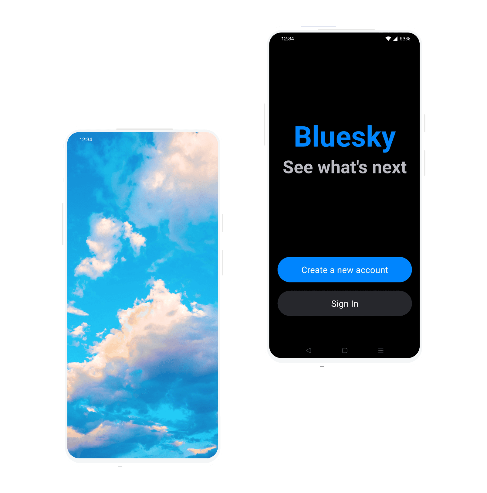
Bluesky
Adding a feature to an existing product

Bluesky
Adding a feature to an existing product
Bluesky
Adding a feature to an existing product
Bluesky
Adding a feature to an existing product
Bluesky
Adding a feature to an existing product
Role
Role
Role
Role
UX Research, UX Designer, UI Designer.
UX Research, UX Designer, UI Designer.
UX Research, UX Designer, UI Designer.
Duration
Duration
Duration
Duration
October - November 2023
October - November 2023
October - November 2023
What is Bluesky?
What is Bluesky?
What is Bluesky?
Bluesky is a relatively new social media site that is experiencing growth despite its closed BETA programme.
While it has a dedicated and growing user base, many of these users do feel it is missing some key features. This in turn begs the questions "what new features do users want to see?", and "how can they be implemented in a way that's in keeping with Bluesky's existing user interface?".

— 01. Research
— 01. Research
Understanding the user base
I started off the process for this project by thinking about the people who currently use Bluesky, and their motivations for doing so. The questions that I really wanted to delve into with my research were as follows:
Who are the primary users of Bluesky?
What do they currently use the platform for?
Why have they chosen the site over competitors?
What other features do users feel are missing from Bluesky currently?
Surveying the community
According to the survey, out of the 19 respondents, the majority of users have migrated to Bluesky from other social media platforms such as Twitter. The survey also revealed the main reasons for using Bluesky, which include promoting their services (such as sex work, cosplay, streaming, artwork, or online shops), keeping in touch with mutual friends, and using the platform as a journal to express their thoughts and feelings.
The results of the survey also asked about features that Bluesky was missing and which options users would like to see added. With this information I chose to focus on adding two different features to the platform:
A way for users to pin a post. Pinned posts are used to make a specific post ‘sticky’, so that the information is always displayed prominently to and is always easy to find.
The ability for users to schedule a post for a future time or date. Scheduling posts allows users to post at “peak” engagement times to generate more engagement by preparing content and then choosing a time or date to post it automatically. These posts are often also used if users are on the go and may not have time or wifi to post at a specific time.
Researching competitors - Twitter and Instagram
As an active social media user myself, I wanted to look at how competitors such as Twitter (also known as X) and Instagram handled pinning and scheduling posts, as these were two of the platforms that survey respondents also mentioned using.
A look into Twitter
Pinning Posts - On mobile, the app drawer slides up to show different options whereas on desktop the options are displayed as a dropdown. Selecting pin to profile brings up information for the user, and accepting shows that post at the top of your profile at all times - even after new posts are made.
Scheduling Posts - Only available on Twitter's desktop platform. Clicking the ‘scheduled post’ button loads a pop-up, where users can select times and dates via a dropdown menu and confirming will add a message at the top of the input field that says when the post will be sent. Clicking ‘tweet’ will then bring up a confirmation message at the bottom of the feed.
Analysing Instagram's features
Pinning Posts - Similarly to Twitter, Instagram uses an app drawer that slides up to show different options. Unlike Twitter, however, selecting ‘pin to your profile’ doesn’t bring up information about the process so it assumes the user knows what this will do. Instagram does provide visual feedback on two screens so users know it has been processed.
Scheduling Posts- Post scheduling is a feature that's only available for professional accounts on the platform. Time and date selection is scrollable, rather than a dropdown.

— 02. Define
— 02. Define
— 02. Define
Shaping the solution
Shaping the solution
Shaping the solution
With research complete, I moved on to my How Might We (HMW) questions and Point Of View (POV) statements in order to refine the main goal of the product and shape the upcoming design process.
With research complete, I moved on to my How Might We (HMW) questions and Point Of View (POV) statements in order to refine the main goal of the product and shape the upcoming design process.
With research complete, I moved on to my How Might We (HMW) questions and Point Of View (POV) statements in order to refine the main goal of the product and shape the upcoming design process.
Point of View Statements
Point of View Statements
Point of View Statements
I would like to help users improve discoverability of posts, as some users want others to see specific content (i.e. commission information) easily.
I would like to help users with busy lives schedule content to post in future, rather than immediately.
I would like to help users improve discoverability of posts, as some users want others to see specific content (i.e. commission information) easily.
I would like to help users with busy lives schedule content to post in future, rather than immediately.
I would like to help users improve discoverability of posts, as some users want others to see specific content (i.e. commission information) easily.
I would like to help users with busy lives schedule content to post in future, rather than immediately.
How Might We Questions
How Might We Questions
How Might We Questions
How might we help users improve the discoverability of their posts on the platform and their profile?
How might we help active users (i.e. content creators) post content in advance to coincide with 'peak' times, or to free up their time?
How might we help users improve the discoverability of their posts on the platform and their profile?
How might we help active users (i.e. content creators) post content in advance to coincide with 'peak' times, or to free up their time?
How might we help users improve the discoverability of their posts on the platform and their profile?
How might we help active users (i.e. content creators) post content in advance to coincide with 'peak' times, or to free up their time?
Creating personas for the target audience
Creating personas for the target audience
Creating personas for the target audience
Instead of multiple personas for this project, I used my existing research and the survey results to create a singular persona to represent the target audience.
Instead of multiple personas for this project, I used my existing research and the survey results to create a singular persona to represent the target audience.
Instead of multiple personas for this project, I used my existing research and the survey results to create a singular persona to represent the target audience.

Elias
Elias
Elias
32 years old · Male · USA based · Graphic Designer
32 years old · Male · USA based · Graphic Designer
32 years old · Male · USA based · Graphic Designer
Elias has 8 years of experience in graphic design, working with top brands and individual clients. An active social media user, Elias transitioned to Bluesky after Twitter's upheaval, seeking transparency and better content control. Elias aims to use Bluesky as a platform to both showcase his talent and connect for professional growth.
Elias has 8 years of experience in graphic design, working with top brands and individual clients. An active social media user, Elias transitioned to Bluesky after Twitter's upheaval, seeking transparency and better content control. Elias aims to use Bluesky as a platform to both showcase his talent and connect for professional growth.
Elias has 8 years of experience in graphic design, working with top brands and individual clients. An active social media user, Elias transitioned to Bluesky after Twitter's upheaval, seeking transparency and better content control. Elias aims to use Bluesky as a platform to both showcase his talent and connect for professional growth.
Pinch points
Adapting to a new piece of technology is hard, especially when the site in question is missing key features like pinned and scheduled posts that assist users with discoverability, and are standard across competitors like Twitter and Instagram.
Adapting to a new piece of technology is hard, especially when the site in question is missing key features like pinned and scheduled posts that assist users with discoverability, and are standard across competitors like Twitter and Instagram.
Adapting to a new piece of technology is hard, especially when the site in question is missing key features like pinned and scheduled posts that assist users with discoverability, and are standard across competitors like Twitter and Instagram.
Goals for using the product
User Goals
User Goals
To showcase and expand his portfolio, and to engage with fellow artists and designers to find work.
To showcase and expand his portfolio, and to engage with fellow artists and designers to find work.
To showcase and expand his portfolio, and to engage with fellow artists and designers to find work.
User needs
A way to ensure that the content they want to showcase is always displayed prominently, rather than being lost further down their profile so that others can see his work and hire or commission him.
A way to ensure that the content they want to showcase is always displayed prominently, rather than being lost further down their profile so that others can see his work and hire or commission him.
A way to ensure that the content they want to showcase is always displayed prominently, rather than being lost further down their profile so that others can see his work and hire or commission him.
Going with the (task and user) flows
Going with the (task and user) flows
Going with the (task and user) flows
Keeping my POV and HMW's in mind, I prioritized designing two task flows based on the two features I was choosing to introduce to the platforms, and how the process might be completed by the user to accomplish their goals.
Keeping my POV and HMW's in mind, I prioritized designing two task flows based on the two features I was choosing to introduce to the platforms, and how the process might be completed by the user to accomplish their goals.
Keeping my POV and HMW's in mind, I prioritized designing two task flows based on the two features I was choosing to introduce to the platforms, and how the process might be completed by the user to accomplish their goals.
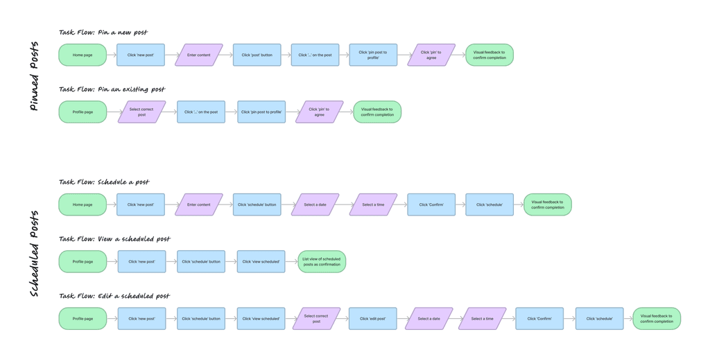
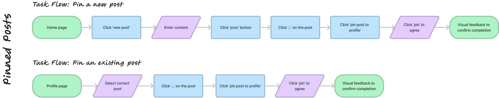
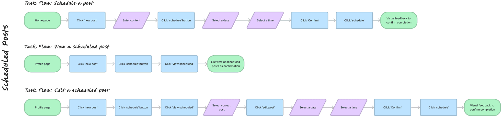
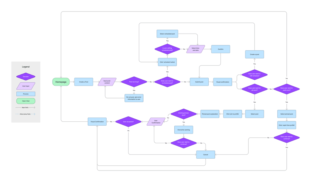
I also took the time to draft a larger user flow (below), which helped me to help me figure out the process behind each new feature and the decisions users would need to make to complete the tasks. This in turn meant that I could get a better understanding of the screens and assets that I would need to make when moving on to prototyping.
I also took the time to draft a larger user flow (below), which helped me to help me figure out the process behind each new feature and the decisions users would need to make to complete the tasks. This in turn meant that I could get a better understanding of the screens and assets that I would need to make when moving on to prototyping.
I also took the time to draft a larger user flow (below), which helped me to help me figure out the process behind each new feature and the decisions users would need to make to complete the tasks. This in turn meant that I could get a better understanding of the screens and assets that I would need to make when moving on to prototyping.
— 03. Design
— 03. Design
— 03. Design
Putting pen to paper - low-fidelity wireframes
Putting pen to paper - low-fidelity wireframes
Putting pen to paper - low-fidelity wireframes
After looking at Bluesky's existing UI, I worked on creating some basic wireframes using pen and paper to communicate my thoughts before moving on to high fidelity prototypes. Interestingly, I chose not to make mid-fis on this project as I felt that the combination of my low-fidelity sketches (below) and my knowledge of Bluesky as a user myself meant I had a strong enough grasp on the UI and how things should function.
After looking at Bluesky's existing UI, I worked on creating some basic wireframes using pen and paper to communicate my thoughts before moving on to high fidelity prototypes. Interestingly, I chose not to make mid-fis on this project as I felt that the combination of my low-fidelity sketches (below) and my knowledge of Bluesky as a user myself meant I had a strong enough grasp on the UI and how things should function.
After looking at Bluesky's existing UI, I worked on creating some basic wireframes using pen and paper to communicate my thoughts before moving on to high fidelity prototypes. Interestingly, I chose not to make mid-fis on this project as I felt that the combination of my low-fidelity sketches (below) and my knowledge of Bluesky as a user myself meant I had a strong enough grasp on the UI and how things should function.
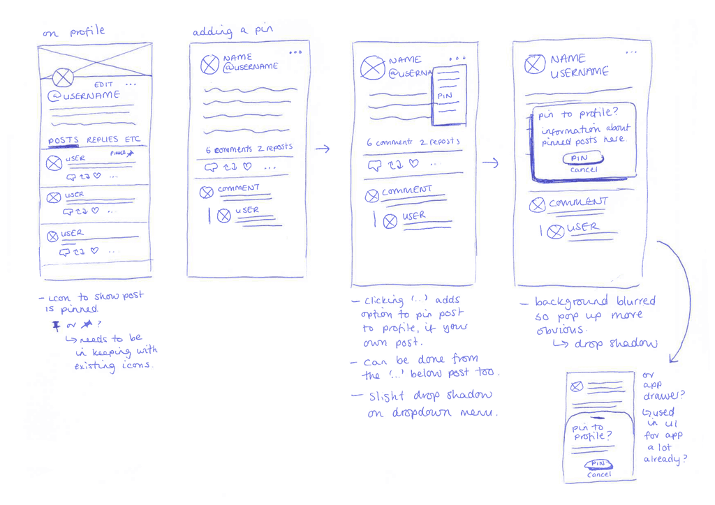
The set of sketches on the left show how I was envisioning the pinned option to work. I originally considered a pop-up, similar to the way Twitter functioned, but after more research into the Bluesky's existing UI I couldn't find anywhere they utilised something like this - instead, they opted for an app drawer, which I had sketched as a possibility too.
The set of sketches on the left show how I was envisioning the pinned option to work. I originally considered a pop-up, similar to the way Twitter functioned, but after more research into the Bluesky's existing UI I couldn't find anywhere they utilised something like this - instead, they opted for an app drawer, which I had sketched as a possibility too.
The set of sketches on the left show how I was envisioning the pinned option to work. I originally considered a pop-up, similar to the way Twitter functioned, but after more research into the Bluesky's existing UI I couldn't find anywhere they utilised something like this - instead, they opted for an app drawer, which I had sketched as a possibility too.
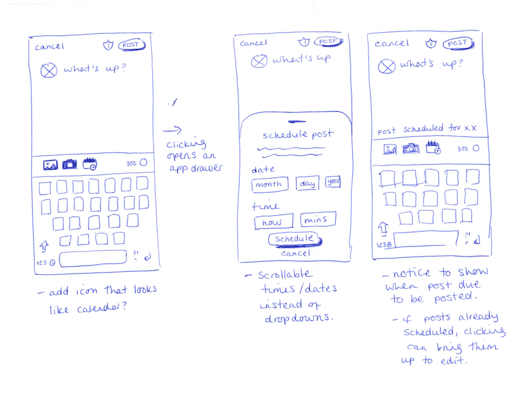
The other set of sketches explore how the scheduler would work. As well as choosing the app drawer again, I also settled on a scrolling date/time picker rather than a drop down menu, as it felt more user friendly.
The other set of sketches explore how the scheduler would work. As well as choosing the app drawer again, I also settled on a scrolling date/time picker rather than a drop down menu, as it felt more user friendly.
The other set of sketches explore how the scheduler would work. As well as choosing the app drawer again, I also settled on a scrolling date/time picker rather than a drop down menu, as it felt more user friendly.
High-Fidelity Prototypes and recreating existing UI
High-Fidelity Prototypes and recreating existing UI
High-Fidelity Prototypes and recreating existing UI
In Figma, I recreated all of Bluesky's existing UI to the best of my ability, so that I could make sure my feature additions felt truly in keeping and could be interacted with as closely as possible to the real deal. Was this entirely necessary? In retrospect, perhaps not but it did teach me a lot so I think it was a worthwhile pursuit.
In Figma, I recreated all of Bluesky's existing UI to the best of my ability, so that I could make sure my feature additions felt truly in keeping and could be interacted with as closely as possible to the real deal. Was this entirely necessary? In retrospect, perhaps not but it did teach me a lot so I think it was a worthwhile pursuit.
In Figma, I recreated all of Bluesky's existing UI to the best of my ability, so that I could make sure my feature additions felt truly in keeping and could be interacted with as closely as possible to the real deal. Was this entirely necessary? In retrospect, perhaps not but it did teach me a lot so I think it was a worthwhile pursuit.
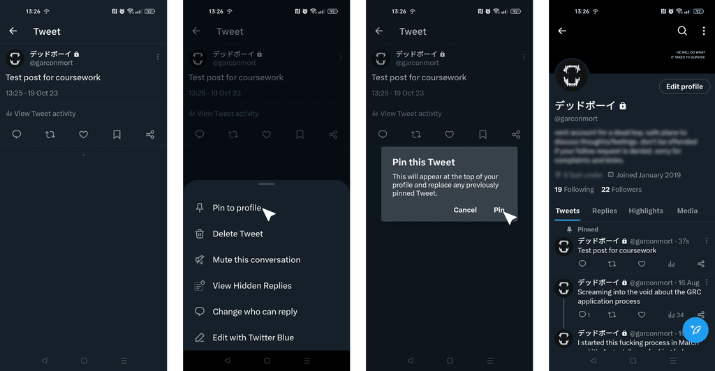
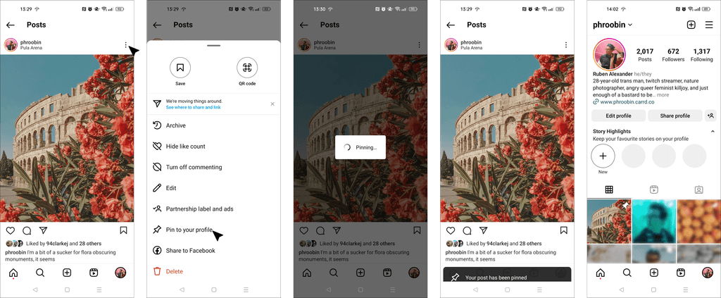
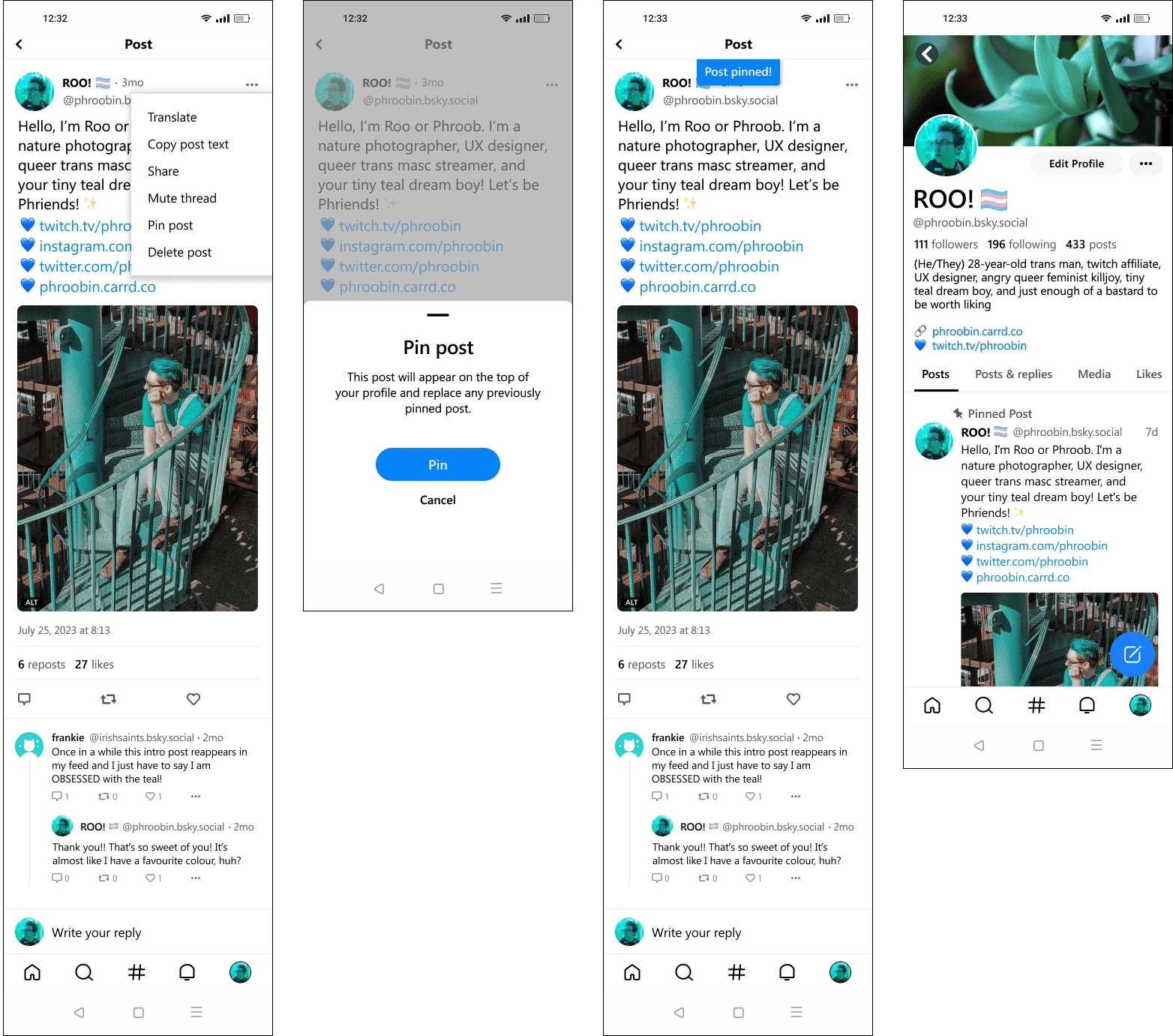
Looking at the way in which Bluesky currently uses the '…' dropdown, it made sense to add the 'pin post' option to this dropdown menu.
This list is also accessible via the user's profile feed, so there are multiple ways to complete the task and they do not need to click into a specific post to pin it.
App drawer springs up and provides further information about the process the user is about to undertake, aiding in learnability for those who may not have encountered the feature before.
After the user has pinned a post, they get visual feedback on the following screen, and navigating back to the profile then shows a pin icon and the words 'pinned post'.

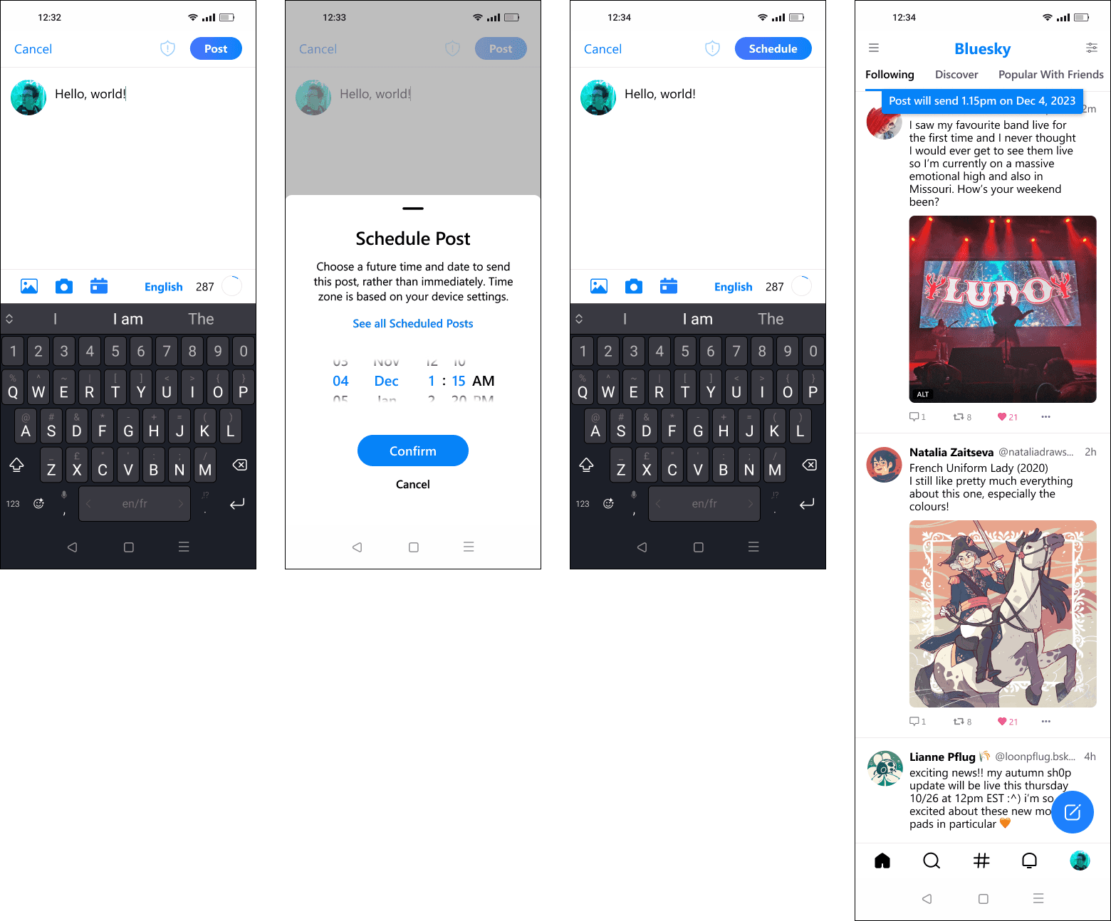
Calendar icon along the bottom of the post screen to indicate the user is able to schedule a post.
Again, app drawer appears to provide information about the process for those unfamiliar.
After a time and date has been selected and confirmed, the 'post' button changes to read 'schedule' to reassure the user that their post isn't sending immediately.
Visual confirmation on the following screen, which directs them back to their main homepage.

— 04. Test
— 04. Test
— 04. Test
Testing the solution
Testing the solution
Testing the solution
My usability tests were run remotely via Google Meet and recorded for further viewing. The 7 participants were aged from 23 - 30, and had various levels of experience with social media platforms. Each person shared their screen with me, and I asked them to talk me through their processes, thoughts, and reasoning (if any) as they navigated the prototype tasks set out.
My usability tests were run remotely via Google Meet and recorded for further viewing. The 7 participants were aged from 23 - 30, and had various levels of experience with social media platforms. Each person shared their screen with me, and I asked them to talk me through their processes, thoughts, and reasoning (if any) as they navigated the prototype tasks set out.
My usability tests were run remotely via Google Meet and recorded for further viewing. The 7 participants were aged from 23 - 30, and had various levels of experience with social media platforms. Each person shared their screen with me, and I asked them to talk me through their processes, thoughts, and reasoning (if any) as they navigated the prototype tasks set out.
Task One
Task One
Task One
Pin an existing post to the test profile.
Specifically looking at where users first look for the option to pin a posty, and how discoverable the feature itself is.
Pin an existing post to the test profile.
Specifically looking at where users first look for the option to pin a posty, and how discoverable the feature itself is.
Pin an existing post to the test profile.
Specifically looking at where users first look for the option to pin a posty, and how discoverable the feature itself is.
Task Two
Task Two
Task Two
Schedule a post to be sent at a future time or date.
Investigating whether or not the existing icon for scheduling a post is intuitive, or if more needs to be done.
Schedule a post to be sent at a future time or date.
Investigating whether or not the existing icon for scheduling a post is intuitive, or if more needs to be done.
Schedule a post to be sent at a future time or date.
Investigating whether or not the existing icon for scheduling a post is intuitive, or if more needs to be done.
The all important results were overwhelmingly positive
The all important results were overwhelmingly positive
The all important results were overwhelmingly positive
The all important results were overwhelmingly positive
All users were able to complete each task in full in under 5 minutes, without error or guidance.
Users said the visual design was in keeping with the existing UI, and that it integrated seamlessly.
All users found the 'pin post' option in the dropdown. When quizzed, explained that they expected it to be there as competitors use a similar system and played into their existing mental model.
When testing, 85% of users chose to tap the ‘…’ dropdown below the post they wanted to pin, as opposed to clicking through and pinning from chosen post, as it meant there were fewer steps/taps needed to complete the task.
100% of users understood the calendar icon to be for scheduling posts, though 25% took some time to identify where it was on the interface.
Though there were things to be improved
Though there were things to be improved
Though there were things to be improved
Though there were things to be improved
Users requested the addition of on-screen visual feedback on the post screen itself after scheduling to confirm they had successfully scheduled the post or remind them it had been done if they were interrupted by something before hitting the ‘schedule button’.
100% of testers mentioned adding a year scroller to the date picker, especially since we’re reaching the end of 2023.
4 out of 7 users requested that visual feedback stay on screen for longer to account for slower readers.
Additional comments from 70% of testers was to ask where the option to see all scheduled posts would live, in case changes needed to be made.

— 05. Iterate
— 05. Iterate
— 05. Iterate
Final prototypes and the changes made
Final prototypes and the changes made
Final prototypes and the changes made
With the feedback from the usability test participants in mind, I went back to my original prototype and worked on the changes to ensure that the final product was as polished as possible. The videos below showcase the final prototypes, but if you'd like to test them for yourself you can do so by clicking this Figma link.
With the feedback from the usability test participants in mind, I went back to my original prototype and worked on the changes to ensure that the final product was as polished as possible. The videos below showcase the final prototypes, but if you'd like to test them for yourself you can do so by clicking this Figma link.
With the feedback from the usability test participants in mind, I went back to my original prototype and worked on the changes to ensure that the final product was as polished as possible. The videos below showcase the final prototypes, but if you'd like to test them for yourself you can do so by clicking this Figma link.
Pinning a post
Pinning a post
Pinning a post
No real changes were made between the first iteration of the taskflow and the final version, other than the visual feedback after the post was pinned staying on screen longer to account for those with a slower reading speed.
No real changes were made between the first iteration of the taskflow and the final version, other than the visual feedback after the post was pinned staying on screen longer to account for those with a slower reading speed.
No real changes were made between the first iteration of the taskflow and the final version, other than the visual feedback after the post was pinned staying on screen longer to account for those with a slower reading speed.
Feedback in general was incredibly positive for this flow; some testers were active Bluesky users already, and commented on how it felt like they were using the existing product while in testing.
Feedback in general was incredibly positive for this flow; some testers were active Bluesky users already, and commented on how it felt like they were using the existing product while in testing.
Feedback in general was incredibly positive for this flow; some testers were active Bluesky users already, and commented on how it felt like they were using the existing product while in testing.
Scheduling a Post
Scheduling a Post
Scheduling a Post
Added year to the date/time picker.
Visual feedback was added to the screen after the time/date was picked so that users could see immediately when it was scheduled for, rather than waiting for the next screen.
Feedback also pushed me to consider and prototype where users could easily find and edit posts they had scheduled in the menu.

— 06. Conclusion
— 06. Conclusion
— 06. Conclusion
Next steps - exploring alternate layouts
Next steps - exploring alternate layouts
Next steps - exploring alternate layouts
My next move would involve digging deeper into the page where users can edit their scheduled posts. At present, it closely resembles Twitter's layout and I'm curious to explore ways of making visualizing scheduled posts more user-friendly. This exploration would extend to analyzing interfaces of indirect competitors such as Google Calendar to guide me towards alternative layouts for this particular page.
My next move would involve digging deeper into the page where users can edit their scheduled posts. At present, it closely resembles Twitter's layout and I'm curious to explore ways of making visualizing scheduled posts more user-friendly. This exploration would extend to analyzing interfaces of indirect competitors such as Google Calendar to guide me towards alternative layouts for this particular page.
My next move would involve digging deeper into the page where users can edit their scheduled posts. At present, it closely resembles Twitter's layout and I'm curious to explore ways of making visualizing scheduled posts more user-friendly. This exploration would extend to analyzing interfaces of indirect competitors such as Google Calendar to guide me towards alternative layouts for this particular page.
What I learned: existing UI and branding are my friends!
What I learned: existing UI and branding are my friends!
What I learned: existing UI and branding are my friends!
Taking on the challenge of adding features to Bluesky for the first time was nerve-wracking, but exciting. I really enjoyed having brand guidelines in place so I could focus on wireframing and prototyping, which is where I shine as a designer. The main struggle I faced was figuring out how to blend my ideas with the existing brand and user interface. It was a balancing act, as I wanted to be innovative but in line with what users were familiar with, all while avoiding copying competitors. This project was a learning curve, but it ultimately taught me the importance of balancing creativity with the established identity of a brand.
Taking on the challenge of adding features to Bluesky for the first time was nerve-wracking, but exciting. I really enjoyed having brand guidelines in place so I could focus on wireframing and prototyping, which is where I shine as a designer. The main struggle I faced was figuring out how to blend my ideas with the existing brand and user interface. It was a balancing act, as I wanted to be innovative but in line with what users were familiar with, all while avoiding copying competitors. This project was a learning curve, but it ultimately taught me the importance of balancing creativity with the established identity of a brand.
Taking on the challenge of adding features to Bluesky for the first time was nerve-wracking, but exciting. I really enjoyed having brand guidelines in place so I could focus on wireframing and prototyping, which is where I shine as a designer. The main struggle I faced was figuring out how to blend my ideas with the existing brand and user interface. It was a balancing act, as I wanted to be innovative but in line with what users were familiar with, all while avoiding copying competitors. This project was a learning curve, but it ultimately taught me the importance of balancing creativity with the established identity of a brand.