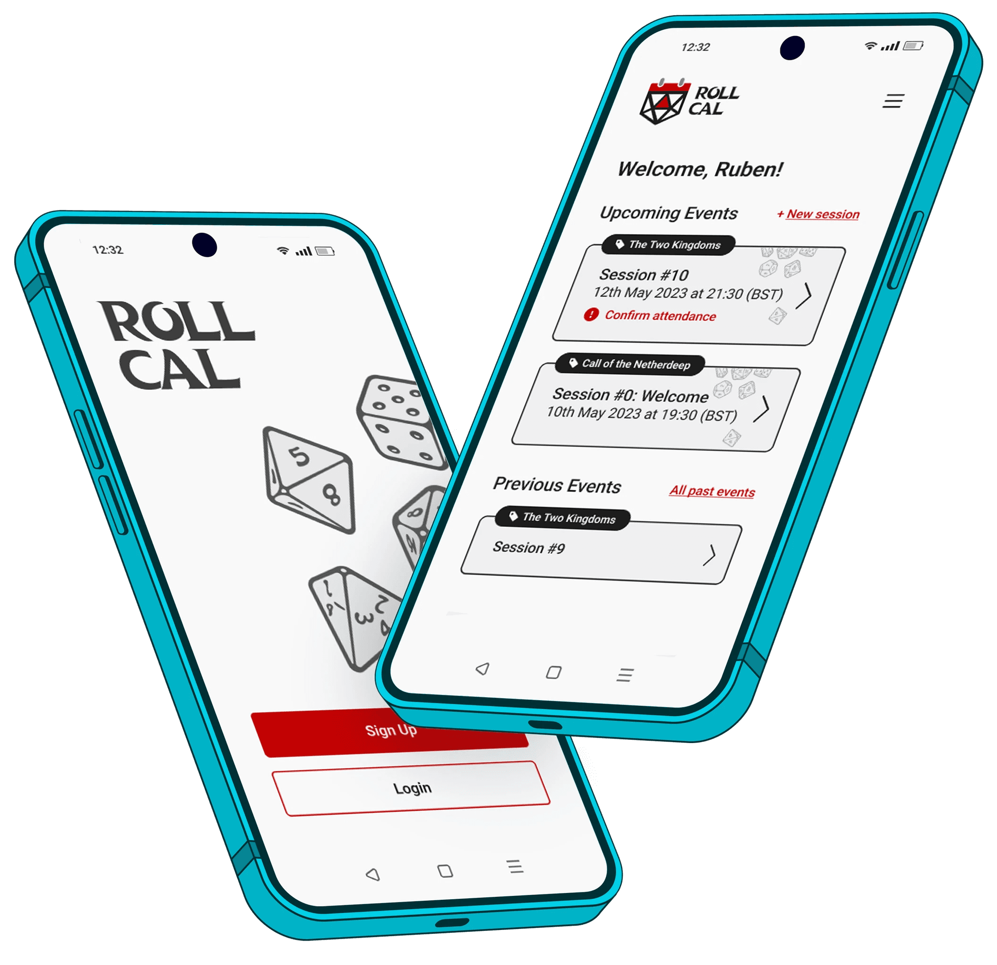
Roll Cal
Roll Cal
Roll Cal
Roll Cal
The creation of a mobile-first site to solve scheduling issues for Tabletop Roleplay Game Players.
The creation of a mobile-first site to solve scheduling issues for Tabletop Roleplay Game Players.
The creation of a mobile-first site to solve scheduling issues for Tabletop Roleplay Game Players.

Role
Role
Role
UX Research, Product Designer, UI Designer.
UX Research, Product Designer, UI Designer.
UX Research, Product Designer, UI Designer.
Duration
Duration
Duration
March - April 2023
March - April 2023
March - April 2023
The Problem
The Problem
The Problem
Time management as an adult is difficult, and individual schedules can often make planning events frustrating.
In the Tabletop Roleplay Game (TTRPG) community, arranging times and dates to run sessions is notoriously difficult for the same reason. While software does exist to aid with this dilemma, at present there is nothing dedicated to this target market and their needs, and so the question arose: "How can we make a product that makes scheduling TTRPG sessions easier for everyone?"

— 01. Research
— 01. Research
Existing TTRPGers and their habits
Existing TTRPGers and their habits
I want to know how existing TTRPG groups schedule their sessions and why they may struggle to do so, so that I can engineer a solution and create an experience that makes scheduling sessions easier.
I want to know how existing TTRPG groups schedule their sessions and why they may struggle to do so, so that I can engineer a solution and create an experience that makes scheduling sessions easier.
Starting off with the above question, I came up with research objectives to help further understand the main problems target users face. I used surveys, competitive analysis, user interviews, and affinity mapping to assist in answering the below:
Starting off with the above question, I came up with research objectives to help further understand the main problems target users face. I used surveys, competitive analysis, user interviews, and affinity mapping to assist in answering the below:
What are the main problems faced when scheduling TTRPG sessions?
How do TTRPG groups typically schedule their sessions?
What would be the user goal when using an app that assists with scheduling?
What other features users may need or want?
What are the main problems faced when scheduling TTRPG sessions?
How do TTRPG groups typically schedule their sessions?
What would be the user goal when using an app that assists with scheduling?
What other features users may need or want?
A preliminary survey helped gain some insight
A preliminary survey helped gain some insight
Prior to competitive analysis and user interviews, I wanted to gather preliminary data through a basic Google survey. I had 43 respondents whose answers helped form interview questions and gave me valuable insight into existing products for analysis.
Prior to competitive analysis and user interviews, I wanted to gather preliminary data through a basic Google survey. I had 43 respondents whose answers helped form interview questions and gave me valuable insight into existing products for analysis.
Analysing existing products used by survey respondents
Analysing existing products used by survey respondents
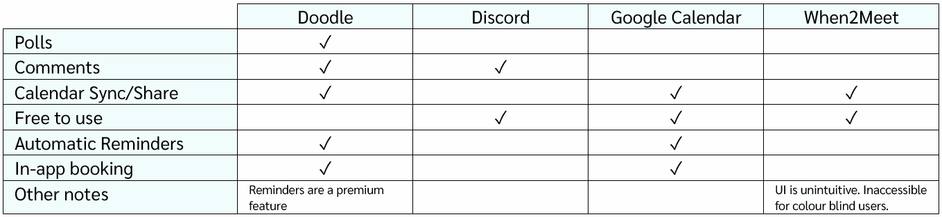
Survey data revealed that some users arrange their sessions through existing products such as Discord, When2Meet, and Google Calendar, and my own research led me to look at Doodle. Through analysing them, I wanted to find out the strengths and weaknesses of these sites, and how I might do something unique with a similar concept.
Survey data revealed that some users arrange their sessions through existing products such as Discord, When2Meet, and Google Calendar, and my own research led me to look at Doodle. Through analysing them, I wanted to find out the strengths and weaknesses of these sites, and how I might do something unique with a similar concept.
I decided to do 1-on-1 interviews to dig deeper
I decided to do 1-on-1 interviews to dig deeper
I conducted 30-minute interviews with 4 individuals who play or have played TTRPGs. Their experience ranged from 6 months to over 10 years of playing and covered both a mix of online vs in-person play, as well as scheduled and unscheduled sessions. My main aim was to understand how their groups schedule sessions, what planning apps they use, and any pinch points they experience when trying to find a suitable time and date to play.
I conducted 30-minute interviews with 4 individuals who play or have played TTRPGs. Their experience ranged from 6 months to over 10 years of playing and covered both a mix of online vs in-person play, as well as scheduled and unscheduled sessions. My main aim was to understand how their groups schedule sessions, what planning apps they use, and any pinch points they experience when trying to find a suitable time and date to play.
Sample Interview Questions
Sample Interview Questions
Can you walk me through the way your group schedules sessions?
Is there anything about the way your group does this that works?
Would you use an app focused on assisting your party with planning sessions?
What, if any, additional features would you find helpful?
Can you walk me through the way your group schedules sessions?
Is there anything about the way your group does this that works?
Would you use an app focused on assisting your party with planning sessions?
What, if any, additional features would you find helpful?
Mapping the results - frustrations, wants, and what to focus on!
Mapping the results - frustrations, wants, and what to focus on!
After mapping the results from the user interviews and the Google survey into information purely about the interviewees and the way that they play TTRPGs, I decided to look deeper into user frustrations and wants to get more of a handle on what the product should and could cater for to make planning sessions easier.
After mapping the results from the user interviews and the Google survey into information purely about the interviewees and the way that they play TTRPGs, I decided to look deeper into user frustrations and wants to get more of a handle on what the product should and could cater for to make planning sessions easier.
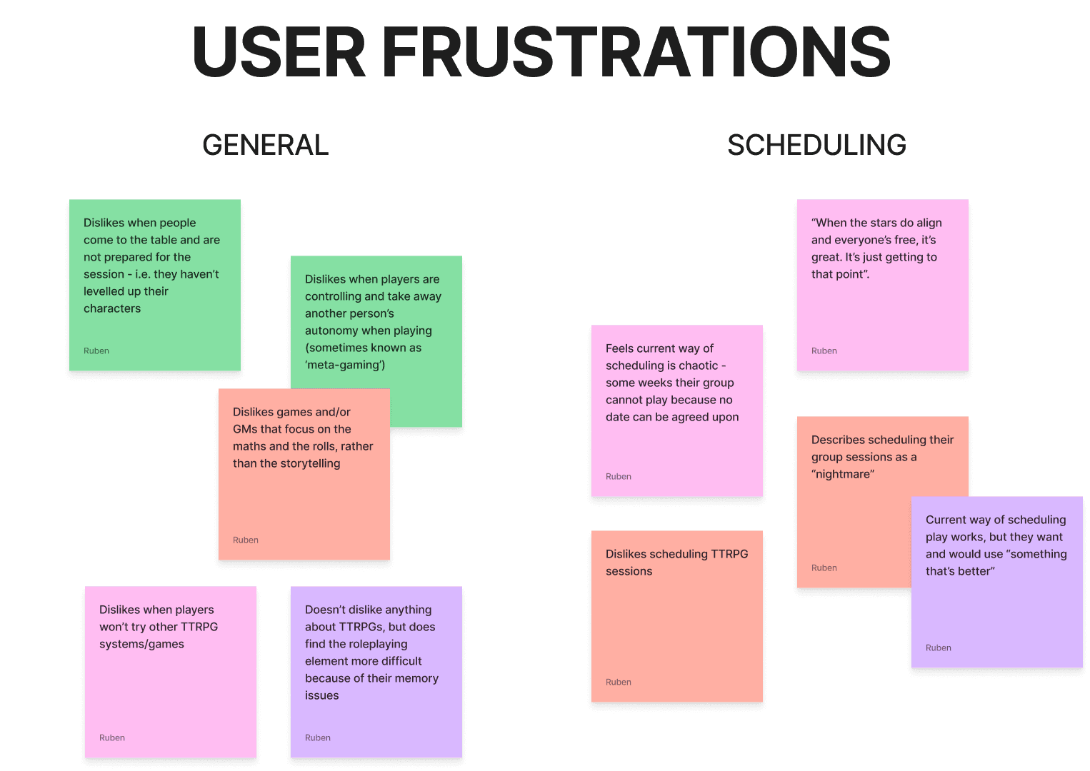
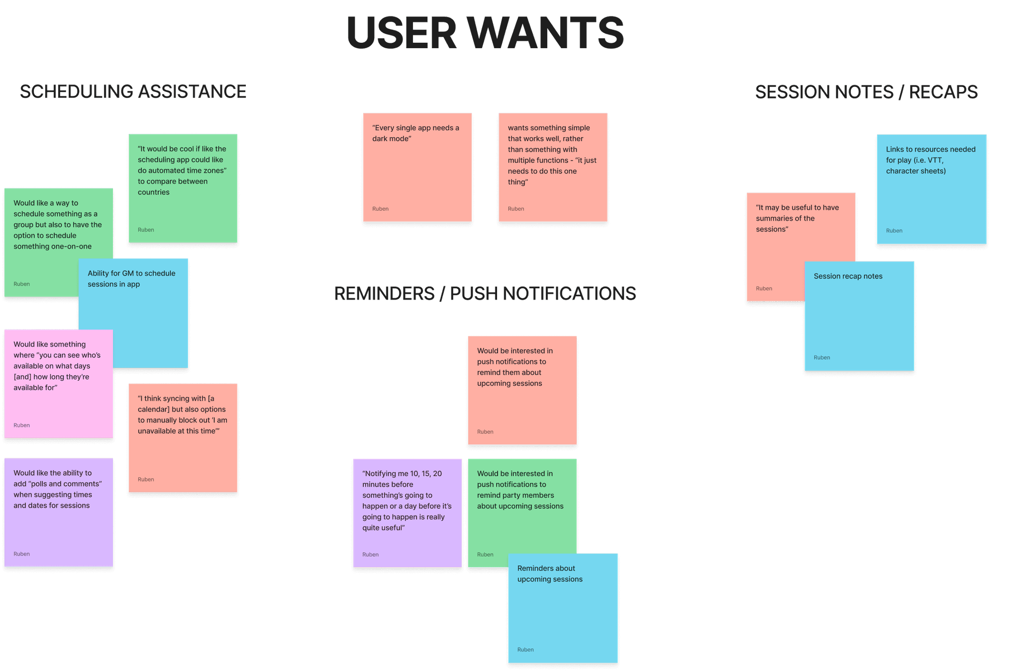
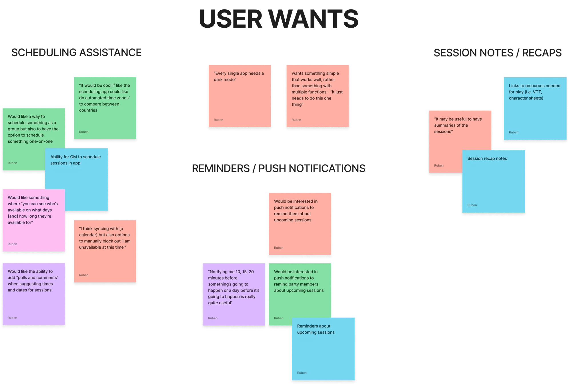
From my research, I determined the following areas to focus on when developing the product:
From my research, I determined the following areas to focus on when developing the product:
A way for users to sync their existing calendars and manually add their availability.
A way for the organiser to book a session in the planning app.
A dedicated space for organisation such as recap notes.
The utilisation of push notifications to alert and remind players about upcoming sessions.
A way for users to sync their existing calendars and manually add their availability.
A way for the organiser to book a session in the planning app.
A dedicated space for organisation such as recap notes.
The utilisation of push notifications to alert and remind players about upcoming sessions.
— 01. Research
Existing TTRPGers and their habits
I want to know how existing TTRPG groups schedule their sessions and why they may struggle to do so, so that I can engineer a solution and create an experience that makes scheduling sessions easier.
Starting off with the above question, I came up with research objectives to help further understand the main problems target users face. I used surveys, competitive analysis, user interviews, and affinity mapping to assist in answering the below:
What are the main problems faced when scheduling TTRPG sessions?
How do TTRPG groups typically schedule their sessions?
What would be the user goal when using an app that assists with scheduling?
What other features users may need or want?
A preliminary survey helped gain some insight
Prior to competitive analysis and user interviews, I wanted to gather preliminary data through a basic Google survey. I had 43 respondents whose answers helped form interview questions and gave me valuable insight into existing products for analysis.
Analysing existing products used by survey respondents
Survey data revealed that some users arrange their sessions through existing products such as Discord, When2Meet, and Google Calendar, and my own research led me to look at Doodle. Through analysing them, I wanted to find out the strengths and weaknesses of these sites, and how I might do something unique with a similar concept.
I decided to do 1-on-1 interviews to dig deeper
I conducted 30-minute interviews with 4 individuals who play or have played TTRPGs. Their experience ranged from 6 months to over 10 years of playing and covered both a mix of online vs in-person play, as well as scheduled and unscheduled sessions. My main aim was to understand how their groups schedule sessions, what planning apps they use, and any pinch points they experience when trying to find a suitable time and date to play.
Sample Interview Questions
Can you walk me through the way your group schedules sessions?
Is there anything about the way your group does this that works?
Would you use an app focused on assisting your party with planning sessions?
What, if any, additional features would you find helpful?
Mapping the results - frustrations, wants, and what to focus on!
After mapping the results from the user interviews and the Google survey into information purely about the interviewees and the way that they play TTRPGs, I decided to look deeper into user frustrations and wants to get more of a handle on what the product should and could cater for to make planning sessions easier.
From my research, I determined the following areas to focus on when developing the product:
A way for users to sync their existing calendars and manually add their availability.
A way for the organiser to book a session in the planning app.
A dedicated space for organisation such as recap notes.
The utilisation of push notifications to alert and remind players about upcoming sessions.

— 02. Define
— 02. Define
Creating personas
Creating personas
Using the results of my research and interviews, I created three distinct personas to fit the profiles of target users and the goals they would be looking to achieve whilst using the product.
Using the results of my research and interviews, I created three distinct personas to fit the profiles of target users and the goals they would be looking to achieve whilst using the product.

Aurora – "Scatterbrain"
Pinch points
Has ADHD and struggles with time keeping.
While she’s a keen note taker, she often misplaces notes and cannot find them when she needs them.
Has ADHD and struggles with time keeping.
While she’s a keen note taker, she often misplaces notes and cannot find them when she needs them.
User needs
Push notifications, to trigger memory and remind about sessions.
Something that allows her to take digital notes.
Push notifications, to trigger memory and remind about sessions.
Something that allows her to take digital notes.

Mars – "Game Master"
Pinch points
His TTRPG group players are not organised, and he struggles to find times that work for everyone.
Not the best with technology.
His TTRPG group players are not organised, and he struggles to find times that work for everyone.
Not the best with technology.
User needs
Low entry barrier. Mars needs something simple and easy to use, both so that he doesn’t give up and so that his TTRPG groups will actually use the software.
Low entry barrier. Mars needs something simple and easy to use, both so that he doesn’t give up and so that his TTRPG groups will actually use the software.

Sol – "Shift Worker"
Pinch points
Colourblind, so existing scheduling software is not accessible.
Shift work makes scheduling hard.
Colourblind, so existing scheduling software is not accessible.
Shift work makes scheduling hard.
User needs
Colourblind features, so that the software is accessible and they’re able to use it.
A way to view different time zones and easily convert them when scheduling.
Colourblind features, so that the software is accessible and they’re able to use it.
A way to view different time zones and easily convert them when scheduling.
Defining the problem and how to fix it
Defining the problem and how to fix it
With research complete and personas created, I moved on to my How Might We (HMW) questions and Point Of View (POV) statements in order to refine the main goal of the product and shape the upcoming design process.
With research complete and personas created, I moved on to my How Might We (HMW) questions and Point Of View (POV) statements in order to refine the main goal of the product and shape the upcoming design process.
Point of View Statements
Point of View Statements
I would like to help those who struggle with time management to remember their TTRPG sessions.
I would like to create a product that is accessible.
I would like to find ways to reduce the chaos of arranging sessions for multiple people to meet.
I would like to help those who struggle with time management to remember their TTRPG sessions.
I would like to create a product that is accessible.
I would like to find ways to reduce the chaos of arranging sessions for multiple people to meet.
How Might We Questions
How Might We Questions
How might we make scheduling easier?
How might we use elements from existing products to aid with learnability, whilst still being unique?
How might we make the product appealing to those who may not need it primarily for scheduling?
How might we make scheduling easier?
How might we use elements from existing products to aid with learnability, whilst still being unique?
How might we make the product appealing to those who may not need it primarily for scheduling?
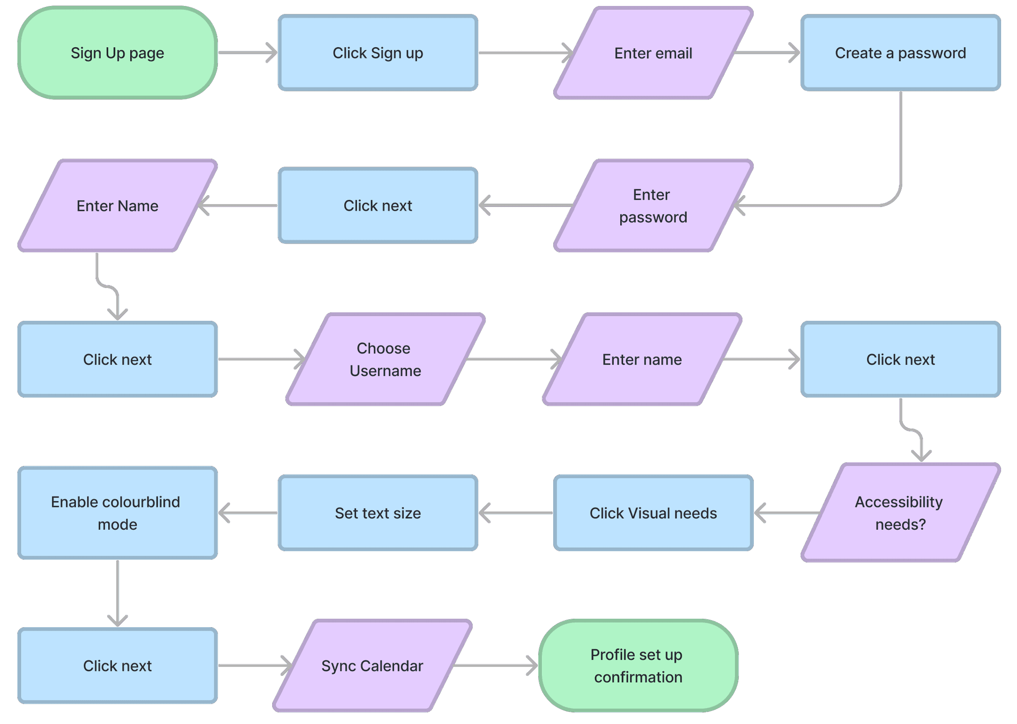
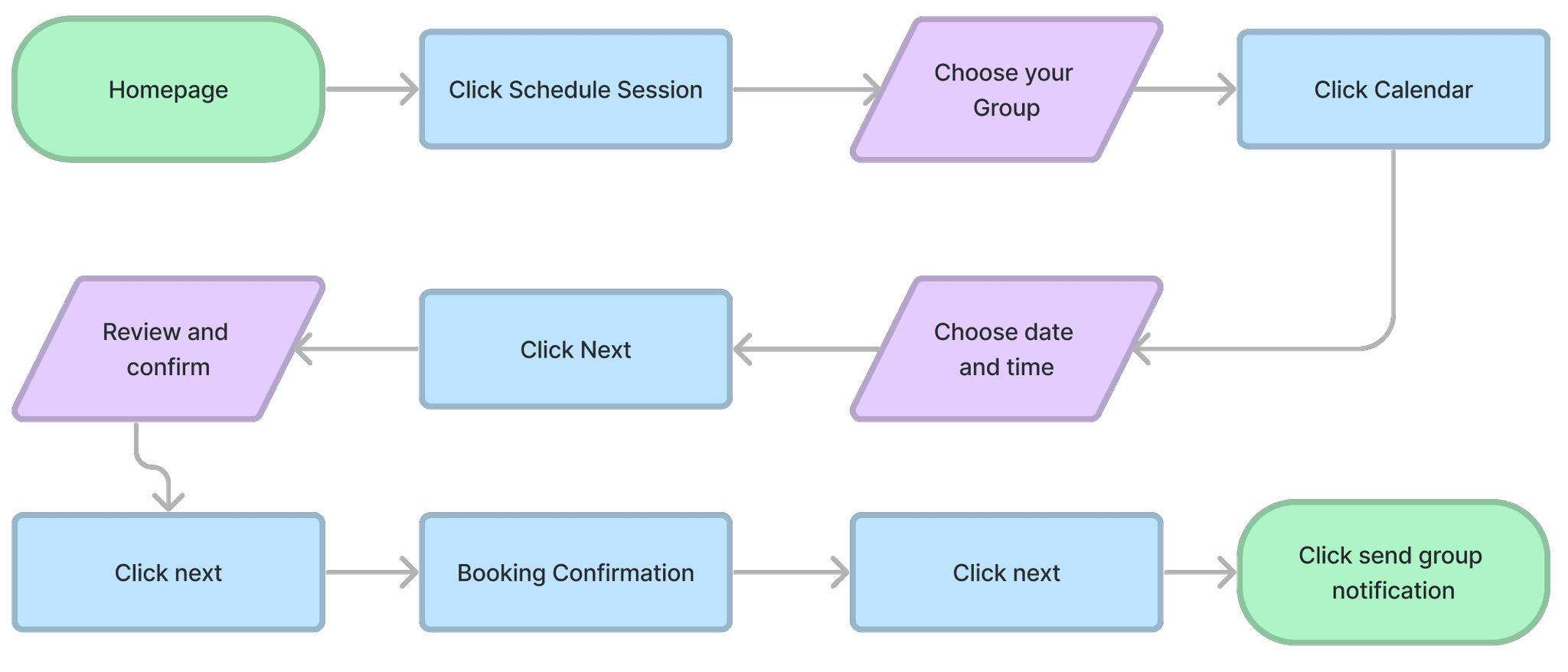
Task Flows
Task Flows
Keeping my POV and HMW's in mind, I designed task flows based on how my personas might use the product.
Keeping my POV and HMW's in mind, I designed task flows based on how my personas might use the product.
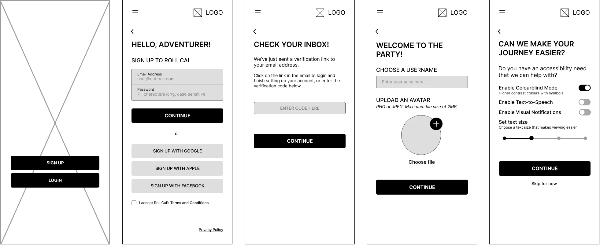
A simple, easy-to-complete onboarding process including accessibility options during the process.
The ability to schedule a session within the app itself, using the player's availability.
A simple, easy-to-complete onboarding process including accessibility options during the process.
The ability to schedule a session within the app itself, using the player's availability.
Accessible Onboarding
Accessible Onboarding
Scheduling a session
Scheduling a session
— 02. Define
Creating personas
Using the results of my research and interviews, I created three distinct personas to fit the profiles of target users and the goals they would be looking to achieve whilst using the product.
Aurora – "Scatterbrain"
Pinch points
Has ADHD and struggles with time keeping.
While she’s a keen note taker, she often misplaces notes and cannot find them when she needs them.
User needs
Push notifications, to trigger memory and remind about sessions.
Something that allows her to take digital notes.
Mars – "Game Master"
Pinch points
His TTRPG group players are not organised, and he struggles to find times that work for everyone.
Not the best with technology.
User needs
Low entry barrier. Mars needs something simple and easy to use, both so that he doesn’t give up and so that his TTRPG groups will actually use the software.
Sol – "Shift Worker"
Pinch points
Colourblind, so existing scheduling software is not accessible.
Shift work makes scheduling hard.
User needs
Colourblind features, so that the software is accessible and they’re able to use it.
A way to view different time zones and easily convert them when scheduling.
Defining the problem and how to fix it
With research complete and personas created, I moved on to my How Might We (HMW) questions and Point Of View (POV) statements in order to refine the main goal of the product and shape the upcoming design process.
Point of View Statements
I would like to help those who struggle with time management to remember their TTRPG sessions.
I would like to create a product that is accessible.
I would like to find ways to reduce the chaos of arranging sessions for multiple people to meet.
How Might We Questions
How might we make scheduling easier?
How might we use elements from existing products to aid with learnability, whilst still being unique?
How might we make the product appealing to those who may not need it primarily for scheduling?
Task Flows
Keeping my POV and HMW's in mind, I designed task flows based on how my personas might use the product.
A simple, easy-to-complete onboarding process including accessibility options during the process.
The ability to schedule a session within the app itself, using the player's availability.
Accessible Onboarding
Scheduling a session

— 03. Design
— 03. Design
— 03. Design
Making things work with mid-fidelity screens
Making things work with mid-fidelity screens
Making things work with mid-fidelity screens
With a good idea of how things could look, I jumped straight into creating mid-fis. Using Figma, I mocked up key screens related to my task flows using basic fonts and greyscale to get more of an idea of how I wanted the product to be laid out rather than focusing in on the small details.
With a good idea of how things could look, I jumped straight into creating mid-fis. Using Figma, I mocked up key screens related to my task flows using basic fonts and greyscale to get more of an idea of how I wanted the product to be laid out rather than focusing in on the small details.
With a good idea of how things could look, I jumped straight into creating mid-fis. Using Figma, I mocked up key screens related to my task flows using basic fonts and greyscale to get more of an idea of how I wanted the product to be laid out rather than focusing in on the small details.
Accessible Onboarding
Accessible Onboarding
Accessible Onboarding
I wanted accessibility to be baked in to my onboarding process, as it was important to interviewees and to me.
Decided to create a flow that asked for the minimum amount of information from users for sign-up - heavily inspired by Discord.
I wanted accessibility to be baked in to my onboarding process, as it was important to interviewees and to me.
Decided to create a flow that asked for the minimum amount of information from users for sign-up - heavily inspired by Discord.
I wanted accessibility to be baked in to my onboarding process, as it was important to interviewees and to me.
Decided to create a flow that asked for the minimum amount of information from users for sign-up - heavily inspired by Discord.
Calendar Input
Calendar Input
Calendar Input
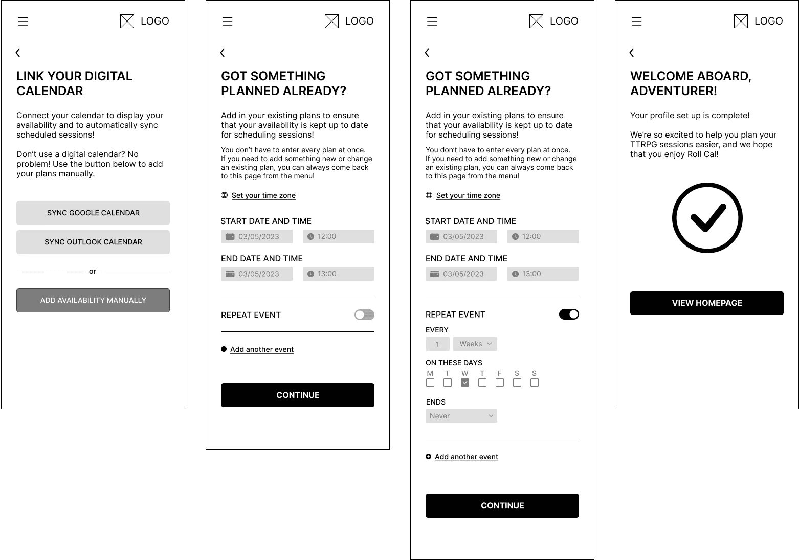
Considering how manually adding times and dates a person is unavailable into the app if they do not use a digitial calendar.
Options for those who use digital calendars, so that events can be synced across each product easily.
Considering how manually adding times and dates a person is unavailable into the app if they do not use a digitial calendar.
Options for those who use digital calendars, so that events can be synced across each product easily.
Considering how manually adding times and dates a person is unavailable into the app if they do not use a digitial calendar.
Options for those who use digital calendars, so that events can be synced across each product easily.
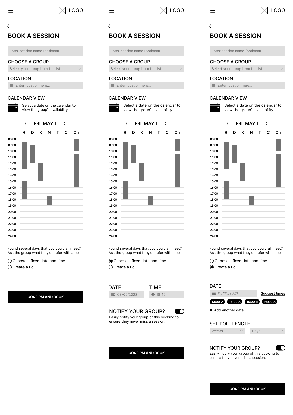
Booking System
Booking System
Booking System
I wanted a way that could immediately communicate the times and dates that users were busy, so that the organiser could reference it when booking in a session.
After discussions with my mentor, we also agreed on the option to suggest multiple dates/times that group members could then vote on.
I wanted a way that could immediately communicate the times and dates that users were busy, so that the organiser could reference it when booking in a session.
After discussions with my mentor, we also agreed on the option to suggest multiple dates/times that group members could then vote on.
I wanted a way that could immediately communicate the times and dates that users were busy, so that the organiser could reference it when booking in a session.
After discussions with my mentor, we also agreed on the option to suggest multiple dates/times that group members could then vote on.
Colours, fonts, and vibe - creating a visual brand
Colours, fonts, and vibe - creating a visual brand
Colours, fonts, and vibe - creating a visual brand
I started by creating a mood board to help narrow down the product's colour palette while evoking the sense of adventure that players feel when taking part in a TTRPG session. I also wanted to find a fun font for the logo but needed it to be something that would pair well with a sans-serif font for the body.
I started by creating a mood board to help narrow down the product's colour palette while evoking the sense of adventure that players feel when taking part in a TTRPG session. I also wanted to find a fun font for the logo but needed it to be something that would pair well with a sans-serif font for the body.
I started by creating a mood board to help narrow down the product's colour palette while evoking the sense of adventure that players feel when taking part in a TTRPG session. I also wanted to find a fun font for the logo but needed it to be something that would pair well with a sans-serif font for the body.
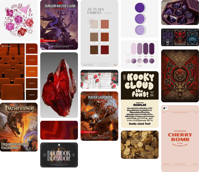
In the end, I chose red, because it fit with the themes I wanted the brand and product to represent: something that was adventurous and fun, whilst also being organised, accessible, and easy-to-use.
In the end, I chose red, because it fit with the themes I wanted the brand and product to represent: something that was adventurous and fun, whilst also being organised, accessible, and easy-to-use.
In the end, I chose red, because it fit with the themes I wanted the brand and product to represent: something that was adventurous and fun, whilst also being organised, accessible, and easy-to-use.
The name of the product itself was settled on fairly quickly - a combination of Roll and Calendar that played into the idea of a roll call, something that the app was designed to help with.
The name of the product itself was settled on fairly quickly - a combination of Roll and Calendar that played into the idea of a roll call, something that the app was designed to help with.
The name of the product itself was settled on fairly quickly - a combination of Roll and Calendar that played into the idea of a roll call, something that the app was designed to help with.
Once the colour palette was settled on, I moved on to designing the logo. This was something I struggled with - I knew I wanted to combine the traditional calendar icon with a D20 dice (something used to play TTRPGs) as it would play into the product name but the logos I was producing felt childish so I reached out to a friend who works in graphic design to help.
Once the colour palette was settled on, I moved on to designing the logo. This was something I struggled with - I knew I wanted to combine the traditional calendar icon with a D20 dice (something used to play TTRPGs) as it would play into the product name but the logos I was producing felt childish so I reached out to a friend who works in graphic design to help.
Once the colour palette was settled on, I moved on to designing the logo. This was something I struggled with - I knew I wanted to combine the traditional calendar icon with a D20 dice (something used to play TTRPGs) as it would play into the product name but the logos I was producing felt childish so I reached out to a friend who works in graphic design to help.
In terms of typography, I wanted the body font to be an accessibility friendly font with a good x-height for smaller breakpoints, so I went with Roboto. This paired nicely with my logo font, Dragon Hunter.
In terms of typography, I wanted the body font to be an accessibility friendly font with a good x-height for smaller breakpoints, so I went with Roboto. This paired nicely with my logo font, Dragon Hunter.
In terms of typography, I wanted the body font to be an accessibility friendly font with a good x-height for smaller breakpoints, so I went with Roboto. This paired nicely with my logo font, Dragon Hunter.

— 04. Test
— 04. Test
Testing the product
Testing the product
My usability tests were run remotely via Google Meet and recorded for further review. The 10 participants were aged from 25 - 35, and had been playing TTRPGs for a varied amount of time. Each participant shared their screen with me, and I asked them to talk me through their thought processes they completed the tasks.
My usability tests were run remotely via Google Meet and recorded for further review. The 10 participants were aged from 25 - 35, and had been playing TTRPGs for a varied amount of time. Each participant shared their screen with me, and I asked them to talk me through their thought processes they completed the tasks.
Task One
Task One
To complete the onboarding process. In this scenario, I asked participants to imagine they were new joiners of Roll Cal who were signing up for the first time.
To complete the onboarding process. In this scenario, I asked participants to imagine they were new joiners of Roll Cal who were signing up for the first time.
Task Two
Task Two
Schedule a new session. In this scenario, participants assumed the role of the Game Master who was trying to book a new session for their TTRPG group.
Schedule a new session. In this scenario, participants assumed the role of the Game Master who was trying to book a new session for their TTRPG group.
Task Three
Task Three
To confirm attendance for a scheduled session. For this task, participants were asked to locate the scheduled session and confirm whether they would be attending or not.
To confirm attendance for a scheduled session. For this task, participants were asked to locate the scheduled session and confirm whether they would be attending or not.
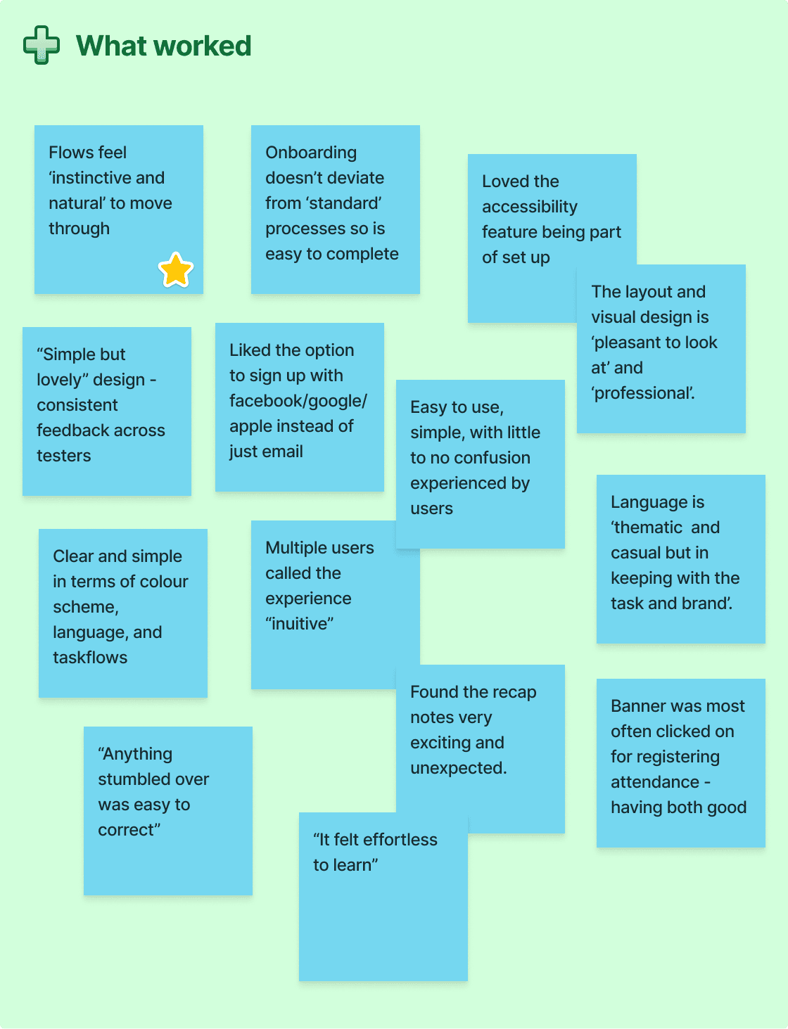
What did the usability testers say?
What did the usability testers say?
With my testing completed, I rewatched the tests and made notes to pick out the comments that explained what did or didn't work for the participants as well as any suggested changes to the UI. I then added all of these to a feedback grid to scan through easily.
With my testing completed, I rewatched the tests and made notes to pick out the comments that explained what did or didn't work for the participants as well as any suggested changes to the UI. I then added all of these to a feedback grid to scan through easily.
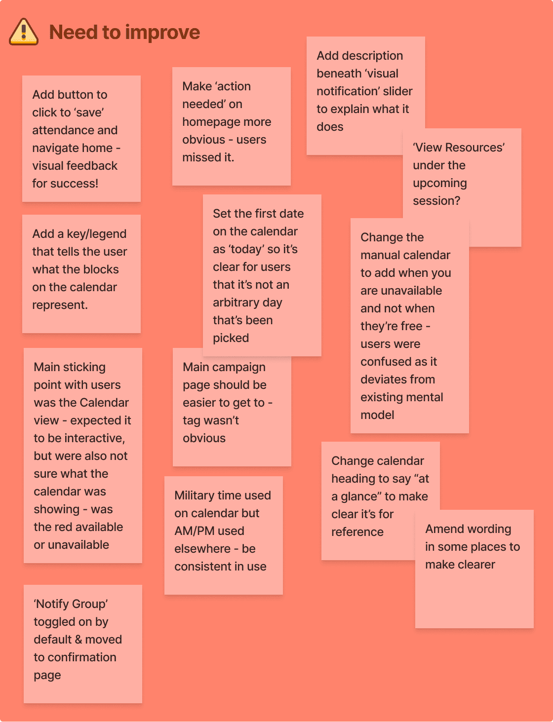
Changes suggested
Changes suggested
While most results were generally positive, testing did reveal some significant issues.
While most results were generally positive, testing did reveal some significant issues.
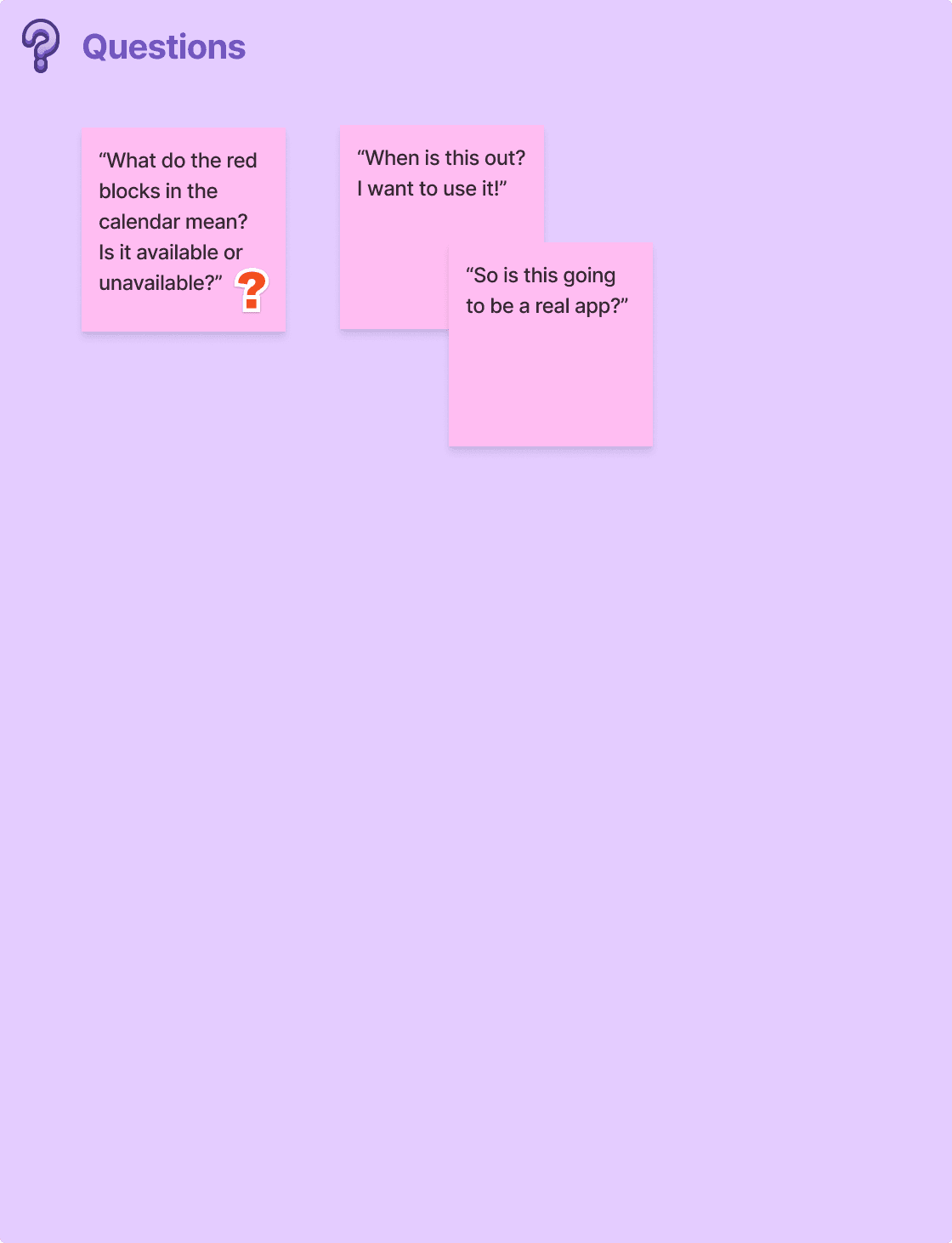
80% of users experienced confusion with the calendar in the booking a session taskflow, as they didn't understand whether the times that were blocked off meant someone was available or unavailable. They were also unsure if the calendar itself was interactive.
50% users noted that the 'action needed' label for the attendance confirmation taskflow was not immediately obvious. They also mentioned that they were not sure if their attendance had been recorded as there was no 'save' button or visual feedback.
— 04. Test
Testing the product
My usability tests were run remotely via Google Meet and recorded for further review. The 10 participants were aged from 25 - 35, and had been playing TTRPGs for a varied amount of time. Each participant shared their screen with me, and I asked them to talk me through their thought processes they completed the tasks.
Task One
To complete the onboarding process. In this scenario, I asked participants to imagine they were new joiners of Roll Cal who were signing up for the first time.
Task Two
Schedule a new session. In this scenario, participants assumed the role of the Game Master who was trying to book a new session for their TTRPG group.
Task Three
To confirm attendance for a scheduled session. For this task, participants were asked to locate the scheduled session and confirm whether they would be attending or not.
What did the usability testers say?
With my testing completed, I rewatched the tests and made notes to pick out the comments that explained what did or didn't work for the participants as well as any suggested changes to the UI. I then added all of these to a feedback grid to scan through easily.
Changes suggested
While most results were generally positive, testing did reveal some significant issues.
80% of users experienced confusion with the calendar in the booking a session taskflow, as they didn't understand whether the times that were blocked off meant someone was available or unavailable. They were also unsure if the calendar itself was interactive.
50% users noted that the 'action needed' label for the attendance confirmation taskflow was not immediately obvious. They also mentioned that they were not sure if their attendance had been recorded as there was no 'save' button or visual feedback.
— 05. Iterate
— 05. Iterate
— 05. Iterate
Finalising the product and making changes
Finalising the product and making changes
Finalising the product and making changes
With the feedback from the usability test participants in mind, I went back to my original prototype and worked on the changes to ensure that the final product was as polished as possible. To test the updated flows yourself, please visit this Figma link, where you can click through each task.
With the feedback from the usability test participants in mind, I went back to my original prototype and worked on the changes to ensure that the final product was as polished as possible. To test the updated flows yourself, please visit this Figma link, where you can click through each task.
With the feedback from the usability test participants in mind, I went back to my original prototype and worked on the changes to ensure that the final product was as polished as possible. To test the updated flows yourself, please visit this Figma link, where you can click through each task.
Onboarding Process
Onboarding Process
Onboarding Process
No changes were made to these screens, as the testing participants had no issues with completing onboarding.
No changes were made to these screens, as the testing participants had no issues with completing onboarding.
No changes were made to these screens, as the testing participants had no issues with completing onboarding.


Booking a Session
Booking a Session
Booking a Session
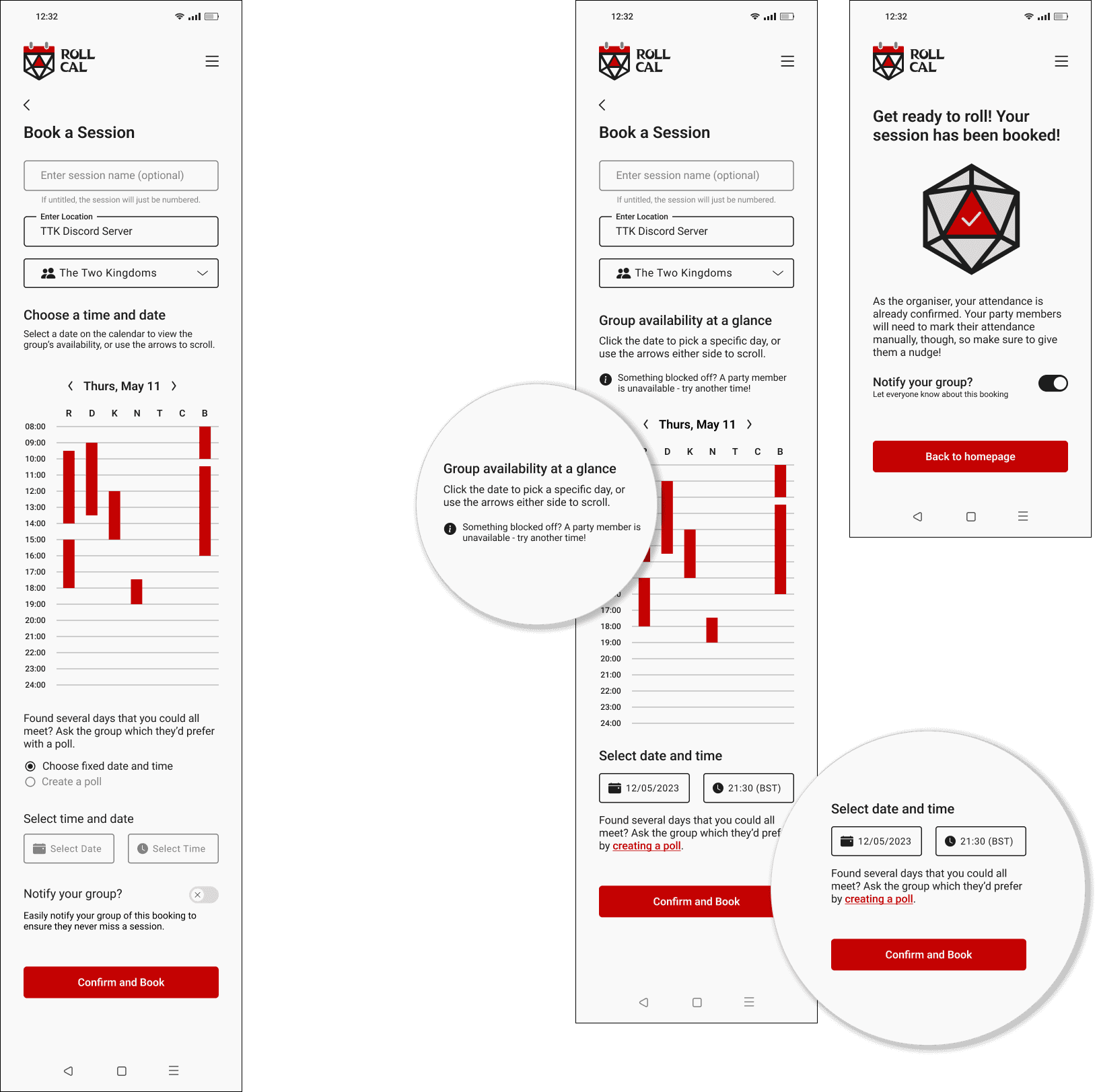
The main issue across my usability testing was related to the calendar booking system. As the main selling point of the product, it was imperative that this part of the product was clear for all users so my iterative process was mainly focused on fine-tuning this.
The main issue across my usability testing was related to the calendar booking system. As the main selling point of the product, it was imperative that this part of the product was clear for all users so my iterative process was mainly focused on fine-tuning this.
The main issue across my usability testing was related to the calendar booking system. As the main selling point of the product, it was imperative that this part of the product was clear for all users so my iterative process was mainly focused on fine-tuning this.
Left: original screen
Right: final iterations
I added a tool-tip to explain that something being blocked off meant that a user is not available and that a session should not be booked at that time.
Removed radio buttons in favour of a quick link to toggle between a set date and time and creating a poll with multiple options.
Changed the location of the group notification toggle to the booking confirmation screen.
Before
Before
Before
After
After
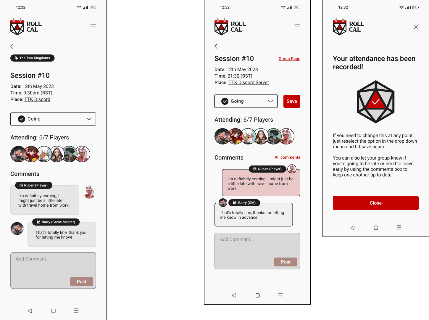
Confirming attendance
Confirming attendance
Confirming attendance
Amended the 'action needed' prompt to be in a much brighter colour, with a CTA that provides information about what users need to do.
Researched existing comments features to align more closely with existing mental models to reduce visual confusion
Added visual feedback for those confirming their attendance to let them know the changes had been saved.
Left: original screen
Right: final iterations
Before
Before
Before
After
After
After
— 06. Conclusion
— 06. Conclusion
What did I learn from the project?
What did I learn from the project?
Creating the TTRPG scheduling app was a significant learning curve, especially for my first major project. Developing a calendar to show the availability of multiple participants was a complex task, demanding attention to both user experience and interface design. The biggest challenge for me, however, was the visual branding and logo design - crafting an identity that resonated with the tabletop gaming community while maintaining uniqueness was crucial!
Creating the TTRPG scheduling app was a significant learning curve, especially for my first major project. Developing a calendar to show the availability of multiple participants was a complex task, demanding attention to both user experience and interface design. The biggest challenge for me, however, was the visual branding and logo design - crafting an identity that resonated with the tabletop gaming community while maintaining uniqueness was crucial!
The best feedback I received, however, was that almost every user testing participant asked when and if the product would be released as they wanted to use it in their TTRPG groups. That said, if there are any app developers out there who would like to take on the challenge with me, please do get in touch!
The best feedback I received, however, was that almost every user testing participant asked when and if the product would be released as they wanted to use it in their TTRPG groups. That said, if there are any app developers out there who would like to take on the challenge with me, please do get in touch!
— 06. Conclusion
What did I learn from the project?
Creating the TTRPG scheduling app was a significant learning curve, especially for my first major project. Developing a calendar to show the availability of multiple participants was a complex task, demanding attention to both user experience and interface design. The biggest challenge for me, however, was the visual branding and logo design - crafting an identity that resonated with the tabletop gaming community while maintaining uniqueness was crucial!
The best feedback I received, however, was that almost every user testing participant asked when and if the product would be released as they wanted to use it in their TTRPG groups. That said, if there are any app developers out there who would like to take on the challenge with me, please do get in touch!